
HYPER TRACK
Re-imagined home blood pressure monitoring experience that delivers personal information to the right person at the right time and fosters life-changing for a healthier life style.

PROJECT INTRO
OVERVIEW
Based on massive physiology, psychology, motivational theories and through the Circulate research program this project focuses on topics surrounding complicated socio-technical systems, integrating design for services, interactive artifacts, information and technology for the prevention of chronic disease through human-centric approach. Utilizing the LEDE process, multi-disciplinary teams will be building on previous data and context to address challenges within Cardiovascular health to create a re-imagined user experience along with UI for assistance
MY ROLE: HEALTH-CARE DESIGN
Design research, analysis, design strategy, UI/UX design, content creator, creative director.
SPONSOR
The Circulate project is an ongoing design research study sponsored by Sunnybrook since 2017. The physician sponsors share their expertise in the background, scope of needs, desired outcomes of the project.
DESIGN TOOL
Figma, Snapple, Sketchbook Pro, Miro Board.
TEAM
Collaborative project.
PROJECT DURATION
Sep 2021 - Dec 2021, 12 weeks
LOCATION
Toronto, Ontario, Canada.

KEY TASK
Canadian Cardiovascular Harmonized National Guidelines Endeavour (C-CHANGE) promotes patient care that assist clinicians formulate a comprehensive treatment plan towards patient priorities. Due to sedentary lifestyle changes we are now seeing younger cohorts showcasing signs of cardiovascular decease earlier in age. The goal of the project is to address these challenges through Co-design.
DESIGN PRINCIPLE
-
Holistic design
-
Easy operability
-
Knowledge translation
-
Support information
-
Personal information and service
-
Deliver personal info to the right person at the right time
-
User friendly, trustful and safe
PROJECT GOAL
-
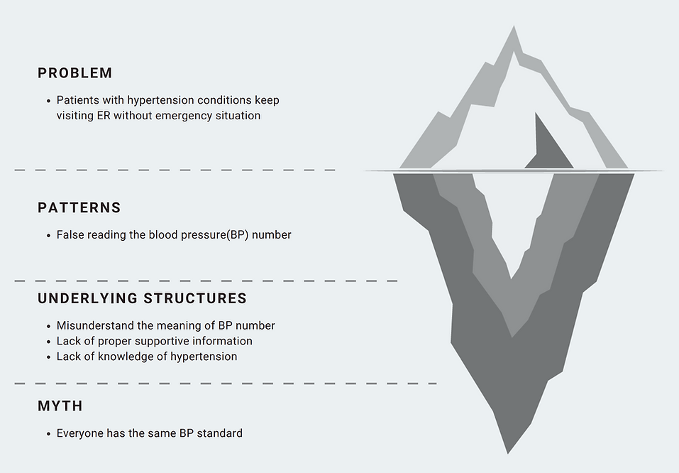
Reducing false-reading & non-emergency ER due to false-reading while easing anxiety/stress associated with monitoring.
-
Making blood pressure monitoring simple & more intuitive.
-
Motivating self-care & self-regulation.
PROJECT FRAMING
-
Who: age (Millennials - 20-45) - Greater chances of user uptake due to higher tech-literacy. Though currently not seeking this service, in the next few years they will become the health-seekers.
-
What: personal information for the right person at the right time.
-
Where: working with Sunnybrook, we are basing this in Canada.
-
When: from the initial CVD diagnosis to continuous reading (refer to journey map).
-
Why: preventing false readings & improving confidence in the reading. Reduce stress/anxiety tied to reading. Motivate self-care & self-regulation.
GUIDING QUESTION
-
How might we incorporate targeted personalized information into the design of a home blood pressure monitor to facilitate self-care, reduce improper use along with false reading; personalized information for the right person at the right time?
-
How can the BP monitor process be more inclusive?
-
How can we make BP monitoring a more social engaging / less isolating event?
KEY WORD
-
Figma
-
Service design
-
Blood pressure monitoring user experience
-
Support information
-
Holistic design
-
Health literacy
-
Co-design
-
Communication
-
Knowledge translation
PROJECT SCOPE
Rather then looking at only the blood pressure monitor itself, we intend to take on a systematic/ service approach to understand individual's motivation & environmental factors as they are presented with this new lifestyle change without overwhelming them. Re-defining what home blood pressure monitoring means.
RESEARCH


TEAM TASK
It's a must to be clear about the main task along with awareness and understanding on relative information such as what was there, what is there, and reasons for it to change/remain, besides pros and cons.
As the patient-centered team our goal is to assess and build on prior Studio studies and identify opportunities in patient and health-seeking contexts. Previous projects have developed solutions for home blood pressure habits for CVD self-management, storyboards and app prototypes for lifestyle changes and concepts for increasing physical activity through informal sports. The goal this year is to accelerate the project by utilizing the LEDE cycle framework, with the intention of rearranging the process to design first followed by conducting research.
DESIGN DIRECTION


SEEKING UX IMPROVMENT
Improving by re-imagining. Here it applies the method of "what could have been easier" and "I wish" based on multi-personas of patient A,B, and C to guarantee comprehensiveness.
An ideal journey map that shows three different users' journey from initial diagnosis to visiting an ER. Persona A over measures their BP (more than recommended), Persona B is our ideal individual who follows the recommendation, & Persona C rarely measures & keeps track of BP.
IDEATION


ME VS THE TEAM
Alone I went for the concept of whole product design brought by holistic mindset to create a series of products that assists new interface and technology. The key is to deliver a whole package to boost user experience and self-branding.
It would be fabulous to have product design that assists and serves UI changes, which improves user experience more effectively. However, the team decided not to take my idea of creating a holistic series of products, rather they chose to focus on only the app design.

My contribution here is to list out all possible scenarios in onboarding and user flow so we can figure out what functionality and interfaces are needed in the app.

ME VS THE TEAM
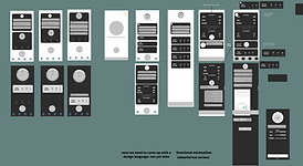
While the team was stuck on what styles to include, I pointed out a scientific and authoritative style.
We created two archetypes for directions that we could go with the app. The Scientist that I recommended represents authority that implies knowledge, power, and trustfulness to do as it indicates, for a sense of safety. The Companion suggested by other teammates prioritizes companying and relaxing atmosphere.
WHY AUTHORITY
Health is complex and when people are uncertain, being "controlled" by a higher force works better than being left out with much freedom, since it soothes concerns on safety and trust.
In order to address patients' concern on how accurate and trustful the app can be, I advise to create a visual style that presents authority, a representation of power and knowledge that makes people feel safe to trust to follow its lead.
DESIGN (PART ONE)
ME VS THE TEAM
Our team moved onto prototyping. While the teammates were working inside the box by collecting design elements tied to the two archetypes shown on the right side, I intended to work outside the box and led creativity fly. My solo work is shown below.


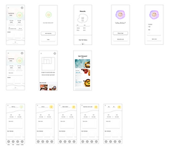
MY SOLO DESIGN: HYPER CUBER
-
The AI cube is funny, sweet, and slightly naughty
-
Straightforward to operate and easy to understand
-
Offers educational content on blood pressure
-
Encouraging when test results do not go well
-
Alarm assistance to re-test
-
Simple and clean visual
-
Gamified approach


MOTIVATIONAL THEORY
Positive user experience starts with motivation with humor and companion, the most effective weapon to fight against fear, exhaustion, reluctance and unwillingness of taking actions.
One of the major issues that we discovered is that patients are stressed and exhausted to take blood pressure by themselves due to intensive seriousness, complex interface and too much information. Eventually mental barrier becomes more of a root cause than technological and informational complexity. So I decided to create an AI character that's funny, humorous, encouraging, comforting, straightforward, and not so serious.
HOME PAGE TO MENU PAGE
-
Major operable instruction on the top right corner
-
Gradience and arrow to imply available contents outside the screen
-
Contents categorized comprehensively and carefully


BP MEASURING: DEVICE TO TESTING
-
Instruction and connecting to measuring device
-
Animation while measuring for relaxation by shifting attention
-
Menu section on top to always remind where users are at
-
Running bar on bottom to show process


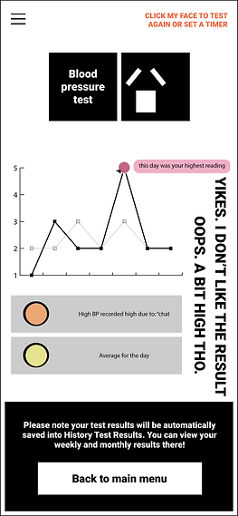
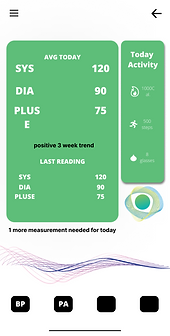
DIFFERENT TESTING RESULT
-
AI facial expression for straightforward metaphor on results
-
Additional options highlighted on top right corner for fast set-up on immediate re-measure or alarm on later re-measure
-
Notification on auto-saving results and where to look for
-
Simple charts to compare different test results
-
One button on the bottom to back to main menu regardless of results

ALARM SETTING & REMINDER
-
Straightforward operation
-
Encouraging AI
-
Alarm reminder on top
-
Responsible alarm service
-
Educational reminder on measuring tips for better results


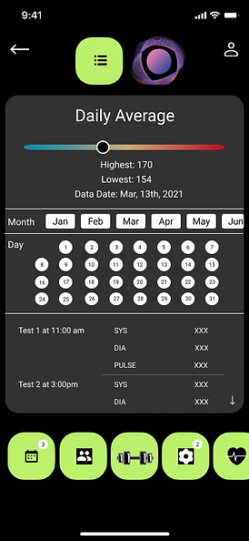
CONSIDERATE UPDATE & ANALYSIS
-
Holistic documentation on users' conditions from food intake and other symptoms
-
Smart and responsive analysis and recommendations on the next step based on diverse situations


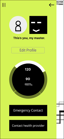
EDUCATION & ACCOUNT INFO
-
Optional reading material for self-education and increasing awareness on blood pressure and relevant deceases, causes, symptoms, etc
-
Encouraging AI for self-education
-
Account info option on every page for easy access
-
One click for emergency contact in case things happen too fast

WHY A GAME
It's not about the "game" style but what UX it brings to users by motivational theories to tackle mental barriers.
Creativity grants surprise, a type of motivation starting with positive and retentive impression on the object. The unprecedented and vivid cube and gamified experience in health care is novelty.
Yes, blood pressure(BP) measuring and relative health concerns are not games. But it is because such intensity caused by seriousness, patients tend to feel reluctant or anxious when measuring BP, which in long run burdens mental health. A game-like style is potential to bring playful and entertaining changes to patients' mood and so their attitude on BP measuring eases. The key is finding balance between intensity and relaxation. As long as it reduces mental burdens and helps patients be more willing on the measuring, it works well.
WORKSHOP

MEETING WITH PATIENT TEAM
MEETING WITH PHYSICIAN TEAM
INSIGHTS: BALANCE
Changes are allowed to make, but if there is too much of a change, psychologically it tends to tear users' boundary of up-take, causing discomfort and long time to adapt not only the interface but also the concept.
A small workshop with around 3-4 individuals with experience in cardio-vascular diseases. This will be a user testing workshops as we propose the two archetypes. The workshop will be around testing clarity, usability, concept, visuals and language.
This workshop if possible will follow a similar format as the patient-centered workshop but will be a bit more detailed as they have greater experience working with patients in cardio-vascular disease. This would revolve around medical accuracy, concept, information structure and confirming assumptions made.
Balance of how much to change explains why making a huge change all at once is risky. The more stylish it is, the more disputed it gets. Not everyone feels easy to adapt to an unprecedented gamified health-care app since the style of previous apps have been comparatively "neutral". This is why Hyper Cube failed in the vote against other prototypes.
DESIGN (PART TWO)
TEAM A & THE SCIENTIST
Based on the feedback gained from the workshop, we decided to break down our team into two groups so we could develop the scientist and the companion at the same time. I was grouped in Team A to work on the scientist, starting with combining all useful elements from previous prototypes.

HYPER CUBE TO HYPER TRACK
The Scientist moved on with Hyper Cuber's legacy that a signature of AI avatar needs to appear on most of pages for fast interaction on major contents, and superior documentation that tracks users' daily intake and other conditions. From there, we got the name Hyper Track.
AVATAR DESIGN
After making a brief onboarding chart, the team was stuck on the AI appearance design that should be relative to being scientific. I suggested to use lines only to draw out shapes and volumes, something shapeless, fluent, and elegant.


RESPONSIVE DESIGN
-
Matched the colors of avatars in response to different BP measuring results
-
Test on notifications on different places and with/without emphasis
-
Visual effect


ONBOARDING & USER FLOW (ROUND ONE)
This step is made upon new research on human psychology with colors and shapes, and previous ideas and testing.

After the first round of user flow testing based on assembly of all interface design pieces, adjustments are to continue as new content is to be added mostly on more data control and relevant interfaces in terms of straightforward visual and easy operation.
CALENDAR DESIGN
While the team was stuck on how to deliver massive historical information fast and efficiently, I created a calendar interface that allows reviews on historical BP measuring time, results, and dates. The key is to offer as many options as possible, but in a straightforward way, where options unfold as users go deeper.

ONBOARDING & USER FLOW (ROUND TWO)
New contents such as calendar function and multi-menu are added. We united the style and made the user flow clearer.

FINAL OUTCOME
NEXT STEP
FEASIBILITY
DEVELOPMENT
This is just one in a series of prototypes. As the sample size for our focus groups was quite small, and participants did not fall under the category of millennials, we hope more co-design workshops can be held with the target population to further strengthen our proposal. This feedback can be built on to develop future iterations of the app.
Getting in contact with a copy writer to work on language would greatly benefit the future designs.
As this is a segment of the overall service design, packaging design is also something to consider as a way to promote the app and also start incentivizing behavioral changes in users to carry their devices that follows a similar visual language to the apps.